Performance Trends in AI

Epistemic Status: moderately confident

Edit To Add: It’s been brought to my attention that I was wrong to claim that progress in image recognition is “slowing down”. As classification accuracy approaches 100%, obviously improvements in raw scores will be smaller, by necessity, since accuracy can’t exceed 100%. If you look at negative log error rates rather than raw accuracy scores, improvement in image recognition (as measured by performance on the ImageNet competition) is increasing roughly linearly over 2010-2016, with a discontinuity in 2012 with the introduction of deep learning algorithms.

Deep learning has revolutionized the world of artificial intelligence. But how much does it improve performance?  How have computers gotten better at different tasks over time, since the rise of deep learning?

In games, what the data seems to show is that exponential growth in data and computation power yields exponential improvements in raw performance. In other words, you get out what you put in. Deep learning matters, but only because it provides a way to turn Moore’s Law into corresponding performance improvements, for a wide class of problems.  It’s not even clear it’s a discontinuous advance in performance over non-deep-learning systems.

In image recognition, deep learning clearly is a discontinuous advance over other algorithms.  But the returns to scale and the improvements over time seem to be flattening out as we approach or surpass human accuracy.

In speech recognition, deep learning is again a discontinuous advance. We are still far away from human accuracy, and in this regime, accuracy seems to be improving linearly over time.

In machine translation, neural nets seem to have made progress over conventional techniques, but it’s not yet clear if that’s a real phenomenon, or what the trends are.

In natural language processing, trends are positive, but deep learning doesn’t generally seem to do better than trendline.

Chess

chesselo1

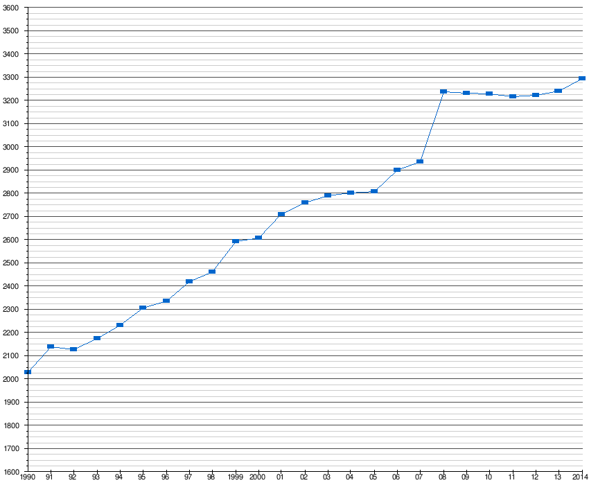
These are Elo ratings of the best computer chess engines over time.

There was a discontinuity in 2008, corresponding to a jump in hardware; this was the Rybka 2.3.1, a tree-search-based engine without any deep learning or indeed probabilistic elements. Apart from that, progress looks roughly linear.

Here again is the Swedish Chess Computer Association data on Elo scores over time:

chesselo2

Deep learning chess engines have only just recently been introduced; Giraffe, originated by Matthew Lai at Imperial College London, was created in 2015. It only has an Elo rating of 2412, about equivalent to late-90’s-era computer chess engines. (Of course, learning to predict patterns in good moves probabilistically from data is a more impressive achievement than brute-force computation, and it’s quite possible that deep-learning-based chess engines, once tuned over time, will improve.)

Go

(Figures from the Nature paper on AlphaGo.)

alphago.png

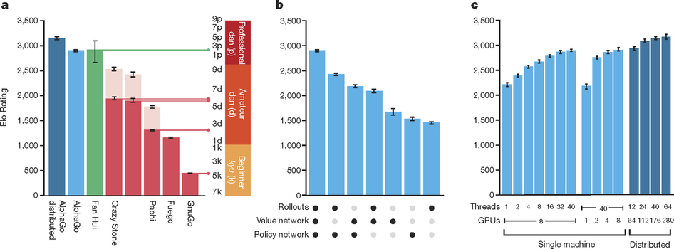
Fan Hui is a human player.  Alpha Go performed notably better than its predecessors Crazy Stone (2008, beat human players in mini go games), Pachi (2011), Fuego (2010), and GnuGo, all MCTS programs, but without deep learning or GPUs. AlphaGo uses much more hardware and more data.

Miles Brundage has argued that AlphaGo doesn’t represent that much of a surprise given the improvements in hardware and data (and effort).  He also graphed the returns in Elo rating to hardware by the AlphaGo team:

alphagovhardware

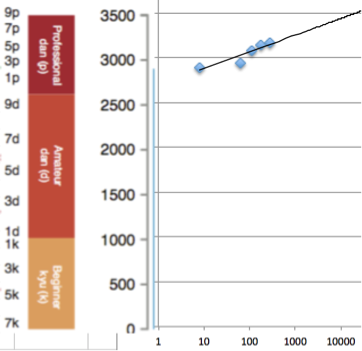
In other words, exponential growth in hardware produces only roughly linear (or even sublinear) growth in performance as measured by Elo score. To do better would require algorithmic innovation as well.

Arcade Games

Artificial Atari games are scored relative to a human professional playtester: (Computer score – random play)/(Human score – random play).

Compare to Elo scores: the ratio of expected scores for player A vs. player B is Q_A / Q_B, where Q_A = 10^(E_A/400), E_A being the Elo score.

Linear growth in Elo scores is equivalent to exponential growth in absolute scores.

Miles Brundage’s blog also offers a trend in Atari performance that looks exponential:

atari

This would, of course, still be plausibly linear in Elo score.

Superhuman performance at arcade games is already here:

ataribygame

This was a single reinforcement learner trained with a convolutional neural net over images of the game screen outputting behaviors (arrows).  Basically it’s dynamic programming, with a nonlinear approximation of the Q-function that estimates the quality of a move; in Deepmind’s case, that Q-function approximator is a convolutional neural net.  Apart from the convnet, Q-learning with function approximation has been around since the 90’s and Q-learning itself since 1989.

Interestingly enough, here’s a video of a computer playing Breakout:

https://www.youtube.com/watch?v=UXgU37PrIFM

It obviously doesn’t “know” the law of reflection as a principle, or it would place the bar near where the ball will eventually land, and it doesn’t.  There are erratic jerky movements that obviously could not in principle be optimal.  It does, however, find the optimal strategy of tunnelling through the bricks and hitting the ball behind the wall.  This is creative learning but not conceptual learning.

You can see the same phenomenon in a game of Pong:

https://www.youtube.com/watch?v=YOW8m2YGtRg

The learned agent performs much better than the hard-coded agent, but moves more jerkily and “randomly” and doesn’t know the law of reflection.  Similarly, the reports of AlphaGo producing “unusual” Go moves are consistent with an agent that can do pattern-recognition over a broader space than humans can, but which doesn’t find the “laws” or “regularities” that humans do.

Perhaps, contrary to the stereotype that contrasts “mechanical” with “outside-the-box” thinking, reinforcement learners can “think outside the box” but can’t find the box?

ImageNet

Image recognition as measured by ImageNet classification performance has improved dramatically with the rise of deep learning.

imagenet

There’s a dramatic performance improvement starting in 2012, corresponding to Geoffrey Hinton’s winning entry, followed by a leveling-off.  Plausibly accuracy is an S-shaped curve.

How does accuracy scale with processing power?

This paper from Baidu illustrates:

baiduscurve

The performance of a deep neural net follows an S-shaped curve over time spent training, but works faster with more GPUs.  How much faster?

baiduscaling

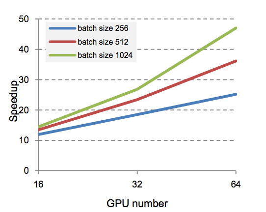
Each doubling in GPUs provides only a linear boost in speed.  At a given time interval for training (as one would have in a timed competition), this means that doubling the number of GPUs would result in a sublinear boost in accuracy.

MNIST

mnist

Using the performance data from Yann LeCun’s website, we can see that deep neural nets hugely improved MNIST digit recognition accuracy. The best algorithms of 1998, which were convolutional nets and boosted convolutional nets due to LeCun, had error rates of 0.7-0.8. Within 5 years, that had dropped to error rates of 0.4, within 10 years, to 0.39 (also a convolutional net), within 15 years, to 0.23, and within 20 years, to 0.21.  Clearly, performance on MNIST is leveling off; it took five years to halve and then 20 years to halve again.

As with ImageNet, we may be getting close to the limits of deep-learning performance (which may easily be human-level.)
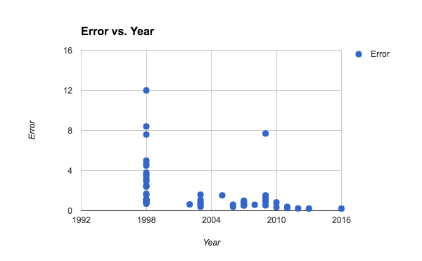
Speech Recognition

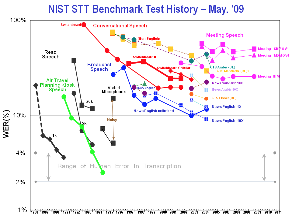
Before the rise of deep learning, speech recognition was already progressing rapidly, though it was leveling off in conversational speech well above the 10% accuracy rate.

speech

Then, in 2011, the advent of context-dependent deep neural network hidden Markov models produced a discontinuity in performance:

speechdeep.png

More recently, accuracy has continued to progress:

Nuance, a dictation software company, shows steadily improving performance on word recognition through to the present day, with a plausibly exponential trend.

nuance

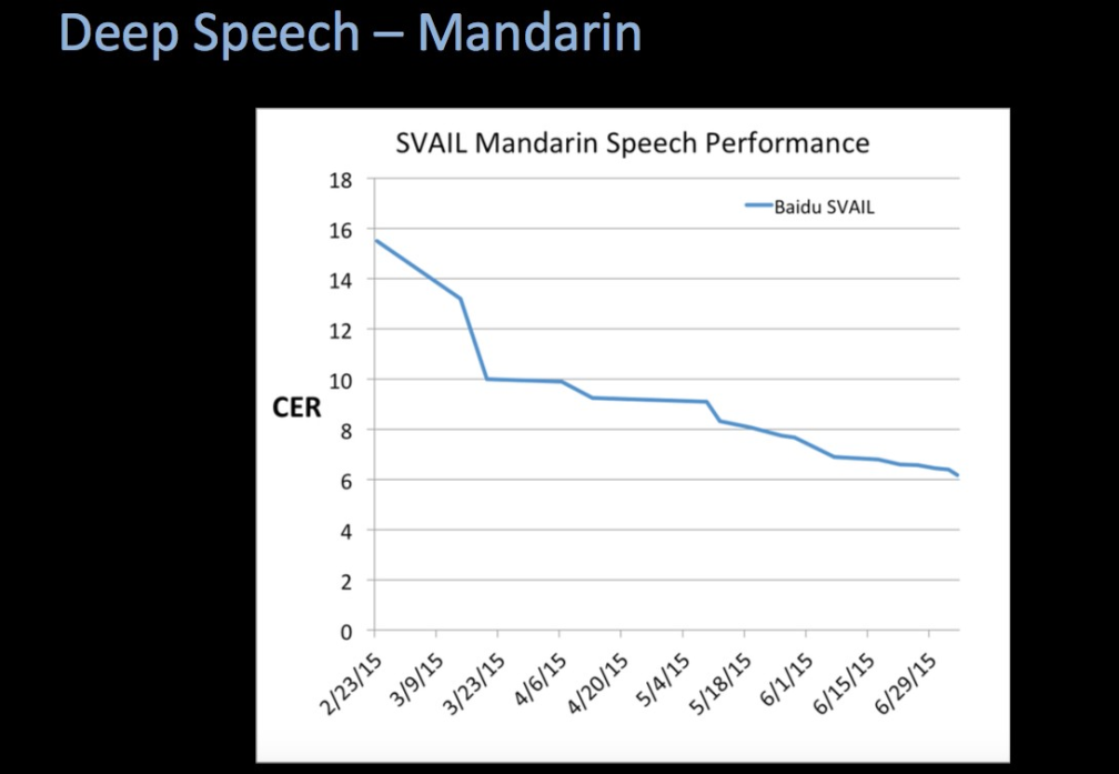
Baidu has progressed even faster, as of 2015, in speech recognition on Mandarin.

baiduspeech.png

As of 2016, the best performance on the NIST 2000 Switchboard set (of phone conversations) is due to Microsoft, with a word-error rate of 6.3%.

Translation

Machine translation is evaluated by BLEU score, which compares the translation to the reference via overlap in words or n-grams.  BLEU scores range from 0 to 1, with 1 being perfect translation.  As of 2012, Tilde’s  had BLEU scores in the 0.25-0.45 range, with Google and Microsoft performing similarly but worse.

In 2016, Google came out with a new neural-network-based version of its translation tool.  BLEU scores on English -> French and English -> German were 0.404 and 0.263 respectively. Human evaluations, however, rated the neural machine translations 60-87% better.

OpenMT, the machine translation contest, had top BLEU scores in 2012 of about 0.4 for Arabic-to-English, 0.32 for Chinese-to-English, 0.24 for Dari-to-English, 0.27 for Farsi-to-English, and 0.11 for Korean-to-English.

In 2008, Urdu-to-English had top BLEU scores of 0.32, Arabic-to-English scores of 0.48, and Chinese-to-English scores of 0.30.

This doesn’t correspond to an improvement in machine translation at all. Apart from Google’s improvement in human ratings, celebrated in this New York Times Magazine article, it’s unclear whether neural networks actually improve BLEU scores at all. On the other hand, scoring metrics may be an imperfect match to translation quality.

Natural Language Processing

The Association for Computational Linguistics Wiki has some numbers on state of the art performance for various natural language processing tasks.

SAT analogies have been becoming more accurate over time, roughly linearly, until the present day when they are roughly as accurate as the average US college applicant.  None of these are deep learning techniques.

satanalogies.png

Question answering (multiple choice of sentences that answer the question) has improved roughly steadily over time, with a discontinuity around 2006.  Neural nets did not start being used until 2014, but were not a discontinuous advance from the best models of 2013.

questions.png

Paraphrase identification (recognizing if one paragraph is a paraphrase of another) seems to have risen steadily over the past decade, with no special boost due to deep learning techniques; the top performance is not from deep learning but from matrix factorization.

paraphrase

On NLP tasks that have a long enough history to graph, there seems to be no clear indication that deep learning performs above trendline.

Trends relative to processing power and time

Performance/accuracy returns to processing power seem to differ based on problem domain.

In image recognition, we see sublinear returns to linear improvements in processing power, and gains leveling off over time as computers reach and surpass human-level performance. This may mean simply that image recognition is a nearly-solved problem.

In NLP, we see roughly linear improvements over time, and in machine translation, it’s unclear if we see any trends in improvements over time, both of which suggest sublinear returns to processing power, but this is not very confident.

In games, we see roughly linear returns to linear improvements in processing power, which means exponential improvements in performance over time (because of Moore’s law and increasing investment in AI).

This would suggest that far-superhuman abilities are more likely to be possible in game-like problem domains.

What does this imply about deep learning?

What we’re seeing here is that deep learning algorithms can provide improvements in narrow AI across many types of problem domains.

Deep learning provides discontinuous jumps relative to previous machine learning or AI performance trendlines in image recognition and speech recognition; it doesn’t in strategy games or natural language processing, and machine translation and arcade games are ambiguous (machine translation because metrics differ; arcade games because there is no pre-deep-learning comparison.)

A speculative thought: perhaps deep learning is best for problem domains oriented around sensory data? Images or sound, rather than symbols. If current neural net architectures, like convolutional nets, mimic the structure of the sensory cortex of the brain, which I think they do, one would expect this result.

Arcade games would be more analogous to the motor cortex, and perceptual control theory suggests that something similar to Q-learning may be going on in motor learning, though I’d have to learn more to be confident in that.  If mammalian motor learning turns out to look like Q-learning, I’d expect deep reinforcement learning to be especially good in arcade games and robotics, just as deep neural networks are especially good in visual and audio classification.

Deep learning hasn’t really proven itself better than trendline in strategy games (Go and chess) or in natural language tasks.

I might wonder if there are things humans can do with concepts and symbols and principles, the traditional tools of the “higher intellect”, the skills that show up on highly g-loaded tasks, that deep learning cannot do with current algorithms. Obviously hard-coding rules into an AI has grave limitations (the failure of such hard-coded systems was what caused several of the AI winters), but there may also be limitations to non-conceptual pattern recognition.  The continued difficulty of automating language-based tasks may be related to this issue.

Miles Brundage points out,

Progress so far has largely been toward demonstrating general approaches for building narrow systems rather than general approaches for building general systems. Progress toward the former does not entail substantial progress toward the latter. The latter, which requires transfer learning among other elements, has yet to have its Atari/AlphaGo moment, but is an important area to keep an eye on going forward, and may be especially relevant for economic/safety purposes.

I agree.  General AI systems, as far as I know, do not exist today, and the million-dollar question is whether they can be built with algorithms similar to those used today, or if there are further fundamental algorithmic advances that have yet to be discovered. So far, I think there is no empirical evidence from the world of deep learning to indicate that today’s deep learning algorithms are headed for general AI in the near future.  Discontinuous performance jumps in image recognition and speech recognition with the advent of deep learning are the most suggestive evidence, but it’s not clear whether those are above and beyond returns to processing power. And so far I couldn’t find any estimates of trends in cross-domain generalization ability.  Whether deep learning algorithms can be general-purpose is perhaps a more theoretical question; what we can say is that recent AI progress doesn’t offer any reason to suspect that they already are.

Police Shootings: How Bad Are Things?

Epistemic Status: rough, back-of-envelope

How many people are killed by police in the US? How does this compare to death rates from other causes?

In 2015, the Washington Post counted 990 Americans shot by police, the Guardian counted 1146 killed, and Fatal Encounters reported 1357, while the FBI and BJS’s 7-year average number of police killings per year were 418 and 380, respectively.

In 2012, an estimated 55,400 people were killed or hospitalized by police; 1 in 291 stops or arrests resulted in hospital-treated injury or death.  1063 suffered fatal injuries. Beatings were by far the most common cause of injury, while shooting was the most common cause of death.

I’m inclined to believe the reporters’ numbers over the FBI and BJS’s numbers, and estimate something like 1000-1500 police killings a year, and tens of thousands of police-caused hospitalizations a year.

Comparison to Total Homicides

According to the CDC, there were 15,809 homicides in America in 2014, and 2.1 million emergency room visits for assault in 2011.

This means that 5-10% of all homicides are committed by police.  3% of all severe assaults are committed by police.

There are about 765,000 police in the US. There are about 152 million men, who commit about 90% of homicides; there were 9972 male homicide perpetrators in 2010.  Thus, roughly, a policeman is 30x as likely to kill you as a randomly chosen man is.

Breakdown by Race

According to the Washington Post, 48% of people killed by police are white, while 25% were black. (The remainder were of a different or unknown race.)  This represents an overrepresentation of black people and underrepresentation of white people, since the US is 62% white and 13% black.  Black people are 2.5x as likely as white people to be killed by police.

There’s some research showing that there is no racial disparity in the rate of police killing per encounter, but researching “per encounter” rates of violence hides a lot under the rug.  If police are biased against black people, they are more likely to “encounter” them, looking for a reason to arrest them, and thus are more likely to escalate to violence. On the other hand, black people commit more crimes (per population) than white people.  Teasing out what constitutes police bias and what constitutes justifiable increased policing intensity is a tough subject.  What’s not in doubt is that the burden of police killings falls disproportionately on black people.

Comparison to Lynching

While this may seem an inflammatory comparison, a lynching, like a police killing, is an extrajudicial killing of a suspected or alleged criminal.

According to the Tuskegee Institute, the year with the highest number of lynchings, 1892, saw 61 whites lynched and 161 blacks lynched.

Given that the US population in 1892 was only about 20% of its current size, this means that, adjusted for population, about as many people are killed by police today as were lynched in the 1890s.

Looking at black people specifically, who were 12% of the US population in 1890, just as they are today, the risk of being lynched for a black person was about twice as high in the 1890s than the risk of being shot by a cop for a black person is today. Lynchings were notably more skewed towards black people than police shootings are.

Comparison to Police States

There is absolutely no comparison in magnitude between anything happening in the US criminal justice system and Stalin’s Great Purge, which killed between 600,000 and 1.2 million people, out of a population of roughly 100 million.

As we noticed with hate crimes, looking at serious problems of violence in the US can put into perspective how terrifyingly, unimaginably bad Hitler and Stalin were. Our problems are not trivial, but totalitarian regimes are…a fundamentally different kind of thing.

Augusto Pinochet had an estimated 40,018 people killed, tortured, or forcibly disappeared between 1973 and 1990, or an estimated 2354 per year, out of a population of 10-13 million.  His regime was at least 50x as deadly as US police are.

South Africa under apartheid tried and executed about 134 political prisoners between 1961 and 1989, which is not quite comparable to police killings, but is a lower rate than exists in the US.  However, South African “deaths in police custody” in 1997-2004, immediately after apartheid, averaged 434 deaths a year, while 763 people were killed by the apartheid government’s police in 1985, an unusually violent year.  Police killings in apartheid South Africa were roughly 5x as common per population as they are in the present-day US, while police killings in 1990’s South Africa were roughly 2.5x as common as they are in the present-day US.

According to a recent human rights agency’s report, 323 people have died in Egyptian prison facilities since 2013 after the recent coup, as well as 624 protesters killed.   This is comparable to the number of police killings in the US.

245 people were killed by Venezuelan security and police forces in 2015; per population, this is about twice as many as police killings in America.

Thailand’s war on drugs, which involved 2800 extrajudicial killings in the first three months after it began in 2003, is at least 10x as deadly as police in America are.

200 people died in police custody last year in Russia, about half the rate of police shootings in America per population.

The US is generally, but not always, less deadly to its citizens than typical authoritarian regimes.  The US has similar rates of death due to police as present-day South Africa, Russia, Venezuela, and Egypt.

Comparisons to other causes of death

Like all kinds of homicide, the number of police homicides pales in comparison to the number of deaths due to disease. Cancer kills more than hundreds of times as many people per year than police do. Suicide kills 30-40x as many.  Infant mortality kills more than 15 times as many.  HIV kills six times as many people.   Doctors and medical researchers are still on the front lines against death.

And prison itself probably causes quite a bit more humanitarian damage than police killings do.

However, justice matters too. An innocent person killed by police is wronged, in a way that a person who succumbs to a disease is not. Police killings count towards the vaguely defined but important category of “evidence that we don’t live in a free and just society”, in the same way that torture, detention without trial, mass surveillance, and other civil liberties violations do.


If Prison Were a Disease, How Bad Would It Be?


Epistemic status: highly uncertain

As of 2013, 2,220,300 adults were incarcerated in US state and federal prisons and county jails.

The majority of these people –about 60% — are incarcerated for nonviolent offenses such as theft, drugs, or public order violations.

How bad is this, in terms of years of life lost?  How much damage is due to being imprisoned?  (ETA: of course, in this context, I am only looking at the harms of prisons, not the benefits due to the deterrent effect of prisons, or the harms of crime. This should not be read as a claim that prison has zero deterrent effect!)

One article attempts to quantify:

African American males can expect to spend 3.09 years lifetime in prison, on average, and Hispanic and Caucasian males will spend on average 1.06 and 0.50 years, respectively.

Comparing life expectancies of people who have and have not gone to prison, as if “prison” were a disability, they compute that white males lose 19,665 person-years of life to prison per 100,000, black males lose 139,507 person-years, and Hispanic males lose 45,766 person-years.

For comparison purposes, here is a table of person-years of life lost to the most common diseases in the US.  Cancer, the top killer, only appears to cost 2882 person-years of life per 100,000.  All causes together only cost 38,211 person-years of life per 100,000.

These numbers are really weird.  They would place prison as being responsible for nearly half of all person-years of life lost.  That would be an utterly shocking result. I’m skeptical.

(ETA: it turns out that the authors of this study were looking at a stock, not a flow, of person-years lost to prison, as Ben notes below. Do not use this study’s numbers to estimate the harms of prison, they don’t make a lot of sense.)

Epidemiologist Ernest Drucker, in his book A Plague of Prisonstried to quantify the years of life lost to imprisonment for drug offenses in New York State.   He estimated a total of 360,000 years of life in prison between 1973 and 2008. This isn’t a fair comparison to diseases, though, because a year living in prison is not as bad as being dead, and prison has harms outside the time actually spent in prison.  If we were to count years in prison as “years of life lost”, however, then, given that there are roughly 19 million people in New York, drug offenses alone cost 55 person-years of life per 100,000, which is a more modest number.  

A study of the dose-response effect of years of prison on mortality found that each additional year in prison (compared to being released on parole) produced a 2-year decline in life expectancy.  For comparison purposes, smokers lose on average 11-12 years of life expectancy compared to nonsmokers.  Getting a diagnosis of colon cancer means losing about 10 years of life expectancy, while getting a diagnosis of testicular cancer means losing 1.3 years of life expectancy.

If we combine these numbers, assume each year in prison is roughly equivalent to two years of life lost, then New York State’s drug incarceration is responsible for about 110 person-years of life per 100,000, which is about half the death rate due to HIV.  This is a more believable number, though it would still make the list of the top 15 causes of death by years of life lost. But it’s only for drug incarceration, which is responsible for only about 1/5 of all incarceration.

If we look at the total number of people incarcerated in New York State, or 77,227, we get an estimated 810 person-years of life lost to prison in New York per 100,000 population, which is more than the national YLL of homicide.  And if we extrapolate to the full 2,220,300 Americans incarcerated, assume 2 years of life lost per year in prison, we get a rate of person-years of life lost due to prison per 100,000 population of 1396, which would make “prison”, if it counted as a cause of death, the sixth worst public health problem in terms of person-years of life lost.

The deadliness of prison, depending on which numbers you use, seems to range from “truly implausibly bad” to “one of the most serious public health problems in America.”

The leading causes of death among former inmates are drug overdose, cardiovascular disease, homicide, and suicide; the highest elevated risks, at 10-12x the population expected rates, were drug overdose and homicide, especially at 0-2 weeks after release. Prison puts people in more danger than they were before.

Some suggested mechanisms for why prison is so dangerous include poor conditions such as overcrowding that expose prisoners to infectious disease; violence within prisons; poor medical care inside prisons; and increased risky behaviors, due to trauma or psychological harm or lack of material opportunities for ex-cons.

For US-centric and present-day-centric utilitarian calculations, prison looks really, really bad. Reducing the prison population seems potentially important on a level comparable to working on Big Problems like cancer, heart disease, diabetes, car accidents, etc.

If nobody were imprisoned for drug crimes, then (aside from any additional risks incurred from the resulting increased drug use) the drop in incarceration alone would save more American lives than eradicating HIV from the US today.


Hate Crimes: A Fact Post

CW: violence, rape, murder, racism.

Epistemic status: a few days’ worth of background reading, way outside my field. This is me “showing my work” in how I orient myself, not a substitute for social science.

Since the Trump election, I’ve been concerned about what, concretely, a resurgence in racism might mean, and how likely it is.  There are people I respect saying “anything could happen” and warning us to stay vigilant and prepared to resist acts of fascist tyranny. There are also people I respect telling everyone to calm down because it’s probably not that bad.

As a grandchild of a resistance fighter against the Nazis, I was raised to believe that it can happen here, and we have to be prepared.  Part of preparation, though, is realism.  What exactly are we facing, and what kind of preparation is appropriate?  The first step is trying to assess the situation accurately.

It may seem naive to start by reviewing hate crime statistics.  The numbers probably aren’t all that accurate; and recorded hate crimes are nowhere near all the harms due to racism.  I’ll be making some attempts to deal with the first issue later in this post.  As for the second, well, this is a very primitive attempt to come to my own conclusions. I would need to be an economist with far more resources and time, in order to, say, estimate the cumulative economic damage of redlining.  For the moment, I want to do the exercise of looking at some numbers and coming to my own conclusions — not because I expect to do that better than social scientists do, but to practice original seeing, which I think is important for getting outside the sway of others’ opinions.

Why hate crime? Because racial violence is one of the concrete “bad outcomes” that we implicitly fear, when we fear a “rise in racism”.  So it makes sense to ask things like how common it is now, and how common it was in the past, or how common it is in other countries, to get a sense of the range of where things can go.

Overview

There are two major data sources in the US for information on hate crimes. One is the Department of Justice’s National Crime Victimization Survey, which is taken from a sample of about 100,000 households, and asks them detailed questions about crimes they’ve been the victims of.  The other is the FBI’s Uniform Crime Reporting database, which collects recorded crimes from police departments across the country. These sources conflict quite a bit.

The US only began recognizing “hate crime” as a legal category in the 90’s, so older information on hate crime is mostly unavailable. For (very rough) comparison purposes, I’m also going to look at statistics on lynching and on race riots, to get a sense of past levels of racial violence. I’ll also briefly compare these to contemporary Russian hate crime statistics, for an example of a country which famously has a severe problem with racial violence.

UCR Data

In 2015, there were 5850 hate crime incidents reported to the FBI by police departments.  

Of these, 36% were motivated by anti-black bias, 13% by anti-gay (male) bias, 12% by anti-white bias, 12% by anti-Jewish bias, 5% by anti-Muslim bias, 4% by anti-LGBT bias excluding gay males, and 2% by anti-Hispanic bias.

(I was surprised to see so low a rate of hate crimes against Hispanics, and so high a rate against whites.)

There were 18 murders and 13 rapes. There were 4482 crimes against persons, of which 41.3% were intimidation, 37.8% assault, and 19.7% aggravated assault.  (That is, a total of 2577 assaults.) The majority of the 2338 hate crimes directed against property were acts of vandalism.

The states with the highest number of hate crimes per capita were:

  • DC
  • Massachusetts
  • North Dakota
  • Montana
  • Kentucky

Southern states in general have lower per-capita rates of hate crime than northern states, according to the UCR; and Mississippi has a grand total of zero hate crimes reported, which is highly suspicious.  There is a serious underreporting problem with hate crimes — several major Southern cities never report hate crimes at all, such as Birmingham, Alabama; Jackson, Mississippi; and Baton Rouge, Louisiana.  So it’s quite likely that these numbers are underestimates.

The UCR has been keeping hate crime stats since 1995. Hate crime rates have been slowly declining in that period.  Anti-black hate crimes are about ⅔ their 90’s level, anti-Jewish hate crimes are about 60% of their 90’s level, anti-white hate crimes are about half, etc.

The number of anti-Muslim hate crimes spiked in 2001, from negligible to about 500, and then declined to a stable but higher-than-before level.

So, clearly, it is possible for current events to cause a spike in hate crimes.  This is a special type of a spike in hate crimes, though: Muslims may have been so small and new a population in the US that they just weren’t a habitual target of bigotry before September 11.  The September 11th hate crimes spike tells us that current events can rapidly create new targets of bigotry, even when they were largely left alone before.

NCVS Data

From 2004-2012, the rate of hate crime victimization in the population, according to the self-reports in the NCVS survey, remained steady at roughly 1 per 1000 persons 12 or older.

This would imply a much higher rate of hate crime than the UCR reports — roughly 260,000 a year — and even if we only count those crimes which survey respondents said they reported to police, that’s still 120,000.  However, according to the NCVS, only 14,380 hate crimes were confirmed by police investigators. Most reports of hate crimes do not result in the police concluding there was a hate crime.  And, of those, we might infer, only a fraction are reported to the UCR, given that the UCR’s hate crime numbers are less than half the number that the NCVS says were confirmed by police.

This low rate of police recording and police reporting is specific to hate crimes, not common across all crime.  The UCR and NCVS also include reporting on non-hate crimes like rape, robbery, aggravated assault, etc. In most of these cases, the number of crimes that the NCVS says were reported to police is comparable to the number of crimes that the UCR says were recorded by police.

Crime # (NCVS 2012) % reported to police (NCVS 2012) # recorded by police (UCR 2012) recording rate
Rape 431840 32.5 90185 0.64
Robbery 578580 60.9 327374 0.93
Aggravated assault 816760 58.4 764449 1.6
Simple assault 3179440 40 n/a n/a
Burglary 2904570 60 1579527 0.91
Motor vehicle theft 564160 83.3 707758 1.5
Theft 11142310 29 5706346 1.76
All hate crime 293790 34 6718 0.067
Violent hate crime 263540 34 4810 0.053

The one exception is hate crime, where only about 5% of hate crimes reported to police are recorded in the UCR.

That this discrepancy exists specifically in hate crimes suggests that police preferentially take hate crimes less seriously than other crimes.  And, indeed, according to the NCVS, police were more likely to take reports and make arrests in non-hate crimes vs. hate crimes.

However, the fact that there are cases where the NCVS numbers significantly undershoot the UCR numbers — giving the nonsensical result that the police record more e.g. motor vehicle thefts than victims report to police — suggests that the NCVS may have some serious sampling bias.

In the NCVS 2012 data, 52% of hate crime victims were white, 13% were black, and 30% were Latino.  This throws some doubt on the much lower rate of anti-Hispanic hate crimes in the UCR data — maybe Latinos/Hispanics are less likely to report hate crimes to the police, or less likely to be taken seriously by the police.

According to the NCVS, 16% of hate crimes were “serious violent crimes” (robbery, aggravated assault, or rape), 44% were “simple assault”, and 22% were property crime.

So How Many Hate Crimes Are There?

The unfortunate fact is that we don’t know how many hate crimes there are, because both our major data sources seem to have serious flaws.

How big a deal is hate crime, in terms of damage to human life? What are the casualty rates?

According to the NCVS,  5% of hate crimes were aggravated assault causing injury, and 10.6% were simple assault causing injury, giving roughly 32,760 injuries a year due to hate crime.

The NCVS doesn’t report murders.  The UCR’s numbers of 18 hate-crime murders a year are probably an underestimate, but also probably not as much of an underestimate as the other types of crime, since I would expect that people are more likely to report murders to the police than other crimes. There were a total of 15,809 homicides in the US in 2011.  If 0.1% of all crimes are hate crimes, as the NCVS reports, and homicide is a representative crime, then this would predict 15 hate-crime homicides a year, which is comparable to the UCR’s numbers.

My tentative order-of-magnitude estimates are that there are 10-20 hate-crime murders a year, and tens of thousands of hate-crime injuries.

Lynchings

According to the Tuskeegee Institute archives, lynchings in 1882-1968 were at most one or two hundred killings a year.

At the peak in 1892, the total number of lynchings in the US was 230, with 161 blacks and 61 whites killed.

Controlling for population growth, and comparing lynchings of black people directly to all hate-crime murders, (yes, obviously this is an imperfect comparison), this means that “hate-crime killings” were roughly 45x as common per population in the late 19th century as they are today.

The NAACP numbers claim there were 3436 people lynched between 1889 and 1922, or an average of 104 lynchings per year.

Lynchings began to decline in the 1920’s, potentially due to a variety of causes: the urbanization of the South, more active anti-lynching efforts by state police and the National Guard, the activism of the NAACP, and the attempt to pass the Dyer Anti-Lynching Bill in 1922. (It passed in the House but failed in the Senate.)

tstr21

(Image from Harry Truman’s report on civil rights.)

It’s worth noting that this is what a climate of lawless terror looks like.

It wasn’t that black people had to use a separate drinking fountain or couldn’t sit at lunch counters, or had to sit in the back of the bus.

You really must disabuse yourself of this idea. Lunch counters and buses were crucial symbolic planes of struggle that the civil rights movement used to dramatize the issue, but the main suffering in the south did not come from our inability to drink from the same fountain, ride in the front of the bus or eat lunch at Woolworth’s.

It was that white people, mostly white men, occasionally went berserk, and grabbed random black people, usually men, and lynched them. You all know about lynching. But you may forget or not know that white people also randomly beat black people, and the black people could not fight back, for fear of even worse punishment.

This constant low level dread of atavistic violence is what kept the system running. It made life miserable, stressful and terrifying for black people.

White people also occasionally tried black people, especially black men, for crimes for which they could not conceivably be guilty. With the willing participation of white women, they often accused black men of “assault,” which could be anything from rape to not taking off one’s hat, to “reckless eyeballing.”

This is going to sound awful and perhaps a stain on my late father’s memory, but when I was little, before the civil rights movement, my father taught me many, many humiliating practices in order to prevent the random, terroristic, berserk behavior of white people. The one I remember most is that when walking down the street in New York City side by side, hand in hand with my hero-father, if a white woman approached on the same sidewalk, I was to take off my hat and walk behind my father, because he had been taught in the south that black males for some reason were supposed to walk single file in the presence of any white lady.

This was just one of many humiliating practices we were taught to prevent white people from going berserk.

I remember a huge family reunion one August with my aunts and uncles and cousins gathered around my grandparents’ vast breakfast table laden with food from the farm, and the state troopers drove up to the house with a car full of rifles and shotguns, and everyone went kind of weirdly blank. They put on the masks that black people used back then to not provoke white berserkness. My strong, valiant, self-educated, articulate uncles, whom I adored, became shuffling, Step-N-Fetchits to avoid provoking the white men. Fortunately the troopers were only looking for an escaped convict. Afterward, the women, my aunts, were furious at the humiliating performance of the men, and said so, something that even a child could understand.

This is the climate of fear that Dr. King ended.

To get that experience, you only need a few dozen actual recorded lynchings per year.  The indirect impact of living under threat of violence far exceeds the literal death count.

This is what it looks like, historically, to have 45x the rate of racial violence of today.

Race Riots

For most of US history before the 1960’s, a “race riot” was racial violence by white people against nonwhite people (usually black, sometimes immigrants such as Filipinos or Mexicans).  Whole towns might be attacked and burned. In the early 20th century, these were extremely bloody: in the Tulsa race riot of 1921, whites literally bombed a black neighborhood from private airplanes, killing about 300 and forcing thousands from their homes.

While lynchings were largely a rural Southern activity, race riots were urban and nationwide.

There is no central repository of race riot casualty statistics that I could find, so I have some quick-and-dirty Internet numbers here; this is not an exhaustive list.

A return to the levels of racial violence of the 1910’s-1920’s would mean, relative to population, roughly a 50x increase in the number of “hate crime” murders compared to today. As with lynching, this is what a climate of terror looks like.

A return to the levels of racial violence of the 1960’s would constitute a roughly 5x jump, compared to the number of hate crime homicides of today. That’s what it looks like to live in what we now remember as a “turbulent” time.

Pre-1963, only 10% of race riots could be attributed to escalation by blacks. Afterwards, most race riots were still started by whites but the proportion became closer to 60/40.

Mass racial violence dissipated through the 70’s and never again reached its 60s peak, with a few exceptions such as the Rodney King riots of 1992, which killed 50 people and caused $1B in property damage.

Hate crimes in Russia

There are estimated tens of thousands of neo-Nazi skinheads in Russia. In 2008, Amnesty International estimated 85,000 neo-Nazis in Russia.  Over the past ten years, there are an average of 56 hate-crime-related deaths a year, and 378 injuries.    Source, from SOVA, a Russian think tank that studies racism and xenophobia in Russia.

Racism in Russia is most commonly directed against Africans, Central Asians, Jews, and Vietnamese. Only a few percent of the Russian population are peoples of the Caucasus, and there are only 186,000 Jews in Russia, so this is a much more intensive campaign of violence than it would be in the US; the US is about 23% nonwhite; so, conservatively, accounting for Russia’s lower total population and lower non-Russian population than the US, racial violence in Russia is maybe 31x as deadly, in terms of risk of being victimized, as it is in the US.  

Once again, this is what a climate of fear and widespread mob violence looks like. Dozens of hate-crime murders per year, more than an order of magnitude more common than hate-crime murder is in the US.

(Anti-LGBT violence is also a serious problem in Russia but we don’t seem to have good statistics on how common it is; one report says 300 attacks per year.)

Did hate crimes in the US increase post-election?

UCR and NCVS numbers come out yearly, so it’s clearly too soon to tell from those sources.

There’s allegedly a 30% jump in NYC hate crimes this year, and the NYPD has instituted a special police unit to fight the uptick.

The SPLC has set up an opportunity for people to report hate crime incidents around the election, but all those they cited were “intimidation” — verbal harassment and threats.  The most common type was anti-immigrant intimidation.  The most common locations were schools.  

Another tracking site for hate crimes reports 79 self-reported incidents of “violence”, but I noted several errors (duplicates, shootings that were apparently non-hate-related, non-violent crimes).

I think that it’s important to be watchful to see if a post-election rise in hate crimes holds up, but we don’t have enough evidence to be confident that there’s been one.

Scenario Planning

The “really bad” scenario for hate crime in the US is a rise of 30-50x in serious mob violence motivated by bigotry and tacitly condoned by the state. This, we know from historical and international evidence, feels from the inside like living in a dangerous, lawless, oppressive place.

I do not think mob violence alone will cause genocide on a much larger scale. The twenty million murders committed by the Nazis are a different, alien, unthinkable scale of operation.  I suspect you need governments for that. Governments that actively want to exterminate a population, not just keep it fearful and subordinate.  Mob violence is much more common than official campaigns of extermination, and is a more likely threat scenario.

One good thing is that it’s probably not possible to jump to 1890’s-1920’s levels of racial mob violence all at once. If that were to happen, we’d see a smaller uptick before it gets that bad.  If we’re watchful, we’ll have warning, and we may be able to counteract the problem.

The SPLC has advice on how to prevent hate crime. I’m not sure how well validated this is, but what they emphasize is community response. Churches and town councils can organize things like prayer meetings, candlelight vigils, public gatherings with marches and speeches, and other public, communal displays of support for the victims of hate crimes and refusal to tolerate hate in the community.  Forming “coalitions for tolerance” to protest hate crimes and support victims of hate can send a forceful message to hate groups that they are not welcome, and potentially prevent future crimes.

I don’t know much about this topic, but I’d probably want to read more on the psychology and dynamics of mob violence, and whether there are known techniques for defusing or preventing it. I’d very much appreciate if more knowledgeable people shared info about this.


Industry Matters 2: Partial Retraction

Epistemic status: still tentative

Some useful comments on the last post on manufacturing have convinced me of some weaknesses in my argument.

First of all, I think I was wrong that most manufacturing job loss is due to trade. There are several economic analyses, using different methods, that come to the conclusion that a minority of manufacturing jobs are lost to trade, with most of the remainder lost to labor productivity increases.

Second of all, I want to refine my argument about productivity.

Labor productivity and multifactor productivity in manufacturing, as well as output, have grown steadily throughout the 20th century — but they are slowing down. The claim “we are making more things than ever before in America” is literally true, but there is also stagnation.

It’s also true that manufacturing employment has dropped slowly through the 70’s and 80’s until today.  This is plausibly due to improvements in labor productivity.

However, the striking, very rapid decline of manufacturing employment post-2000, in which half of all manufacturing jobs were lost in fifteen years, looks like a different phenomenon. And it does correspond temporally to a drop in output growth and productivity growth.  It also corresponds temporally to the establishment of normal trade relations with China, and there is more detailed evidence that there’s a causal link between job loss and competition with China.

My current belief is that the long-term secular decline in manufacturing employment is probably just due to the standard phenomenon where better efficiency leads to employing fewer workers in a field, the same reason that there are fewer farmers than there used to be.

However, something weird seems to have happened in 2000, something that hurt productivity growth.  It might be trade.  It might be some kind of “stickiness” effect where external shocks are hard to recover from, because there’s a lot of interdependence in industry, and if you lose one firm you might lose the whole ecosystem.  It might be some completely different thing. But I believe that there is a post-2000 phenomenon which is not adequately explained by just “higher productivity causes job loss.”

Most manufacturing job loss is due to productivity; only a minority is due to trade

David Autor‘s economic analysis concluded that trade with China contributed 16% of the US manufacturing employment decline between 1990 and 2000, 26% of the decline between 2000 and 2007, and 21% over the full period.  He came to this conclusion by looking at particular manufacturing regions in the US, looking at their exposure to Chinese imports in the local industry, and seeing how much employment declined post-2000.  Regions with more import exposure had higher job loss.

Researchers at Ball State University also concluded that trade was responsible for a minority of manufacturing job loss during the period 2000-2010: 13.4% due to trade, and 87.8% due to manufacturing productivity growth.  This was calculated using import numbers and productivity numbers from the U.S. Census and the Bureau of Labor Statistics, under the simple model that the change in employment is a linear combination of the change in domestic consumption, the change in imports, the change in exports, and the change in labor productivity.

Josh Bivens of the Economic Policy Institute, using the same model as the Ball State economists, computes that imports were responsible for 21.15% of job losses between 2000 and 2003, while productivity growth was responsible for 84.32%.

Justin Pierce and Peter Schott of the Federal Reserve Board observe that industries where the 2000 normalization of trade relations with China would have increased imports the most were those that had the most job loss. Comparing job loss in above-median impact-from-China industries vs. below-median impact-from-China industries, the difference in job loss accounts for about 29% of the drop in manufacturing employment from 2000 to 2006.

I wasn’t able to find any economic analyses that argued that trade was responsible for a majority of manufacturing job losses. It seems safe to conclude that most manufacturing job loss is due to productivity gains, not trade.

It’s also worth noting that NAFTA doesn’t seem to have cost manufacturing jobs at all.

Productivity and output are growing, but have slowed since 2000.

Real output in manufacturing is growing, and has been since the 1980’s, but there are some signs of a slowdown.

Researchers at the Economic Policy Institute claim that slowing manufacturing productivity growth and output growth around 2000 led to the sharp drop in employment.  If real value added in manufacturing had continued growing at the rate it had been in 2000, it would be 1.4x as high today.

Manufacturing output aside from computers and electronic products has been slow-growing since the 90’s.  The average annual output growth rate, 1997-2015, in manufacturing, was 12% in computers, but under 4% in all other manufacturing sectors. (The next best was motor vehicles, at 3% output growth rate.)

US motor vehicle production has been growing far more slowly than global motor vehicle production.

Here are some BLS numbers on output in selected manufacturing industries:

As an average over the time period, this growth rate represents about 2.5%-3.5% annual growth, which is roughly in line with GDP growth.  So manufacturing output growth averaged since the late 80’s isn’t unusually bad.

Labor productivity has also been rising in various industries:

However, when we look at the first and second derivatives of output and productivity, especially post-2000, the picture looks worse.

Multifactor productivity seems to have flattened in the mid-2000’s, and multifactor productivity growth has dropped sharply.  Currently, multifactor productivity is actually dropping.

Manufacturing labor productivity growth is positive, but lower than it’s been historically, at about 0.45% in 2014, and a 4-year moving average of 2.1%, compared to 3-4% growth in the 90’s.

Multifactor productivity in durable goods is down in absolute terms since about 2000 and hasn’t fully recovered.

(Multifactor productivity refers to the returns to labor and capital. If multifactor productivity isn’t growing, then while we may be investing in more capital, it’s not necessarily better capital.)

Labor productivity growth in electronics is dropping and has just become negative.

Labor productivity growth in the auto industry is staying flat at about 2%.

Manufacturing output growth has dropped very recently, post-recession, to about 0. From the 80’s to the present, it was about steady, at roughly 1%.  By contrast, global manufacturing growth is much higher: 6.5% in China, 1.9% globally.  And US GDP growth is about 2.5% on average.

In some industries, like auto parts and textiles,  raw output has dropped since 2000. (Although, arguably, these are lower-value industries and losing output there could just be a sign that the US is moving up the value chain.)

Looking back even farther, there is a slowdown in multifactor productivity growth in manufacturing, beginning in the early 70’s. Multifactor productivity grew by 1.5% annually from 1949-1973, and only by 0.3% in 1973-1983.  Multifactor productivity growth today isn’t clearly unprecedentedly low, but it’s dropping to the levels of stagnation we saw in the 1970’s, or even below.

Basically, recent labor productivity is positive but not growing and in some cases dropping; output is growing slower than GDP; and multifactor productivity is dropping. This points to there being something to worry about.

What might be going on?

Economist Jared Bernstein argues that automation doesn’t explain the whole story of manufacturing job loss. If you exclude the computer industry, manufacturing output is only about 8% higher than it was in 1997, and lower than it was before the Great Recession.  The growth in manufacturing output has been “anemic.”  He says that factory closures have large spillover effects. Shocks like the rise of China, or a global glut of steel in the 1980’s, lead to US factory closures; and then when demand recovers, the US industries don’t.

This model also fits with the fact that proximity matters a lot.  It’s valuable, for knowledge-transfer reasons, to build factories near suppliers.  So if parts manufacturing moves overseas, the factories that assemble those parts are likely to relocate as well. It’s also valuable, due to shipping costs, to locate manufacturing near to expensive-to-ship materials like steel or petroleum.  And, also as a result of shipping costs, it’s valuable to locate manufacturing in places with good transportation infrastructure. So there can be stickiness/spillover effects, where, once global trade makes it cheaper to make parts and raw materials in China, there’s incentives pushing higher-value manufacturing to relocate there as well.

It doesn’t seem to be entirely coincidence that the productivity slowdown coincided with the opening of trade with China. The industries where employment dropped most after 2000 were those where the risk of tariffs on Chinese goods dropped the most.

However, this story is still consistent with the true claim that most lost manufacturing jobs are lost to productivity, not trade. Multifactor productivity may be down and output and labor productivity may be slowing, but output is still growing, and that growth is still big enough to drive most job loss.

Industry Matters

Epistemic status: tentative

In the wake of the election, I’ve been thinking about the decline of manufacturing in America.

The conventional story, the one I’d been told by the news, goes as follows. Cheap labor abroad competes with US manufacturing jobs; those jobs aren’t coming back; most manufacturing jobs are lost to robots, not trade, anyhow; this is tragic for factory workers who lose their jobs, and perhaps they should be compensated with more generous social services, but overall the US’s shift towards a service economy is for the best.  Opposition to outsourcing, while perhaps an understandable emotional reaction from the hard-hit working class, is simply bad economics.  At best, the goal of keeping manufacturing jobs at home is a concession to the dignity and self-image of workers; at worst, it’s wooly-headed socialism or xenophobia.

But what if that story were not true?

Here’s an alternative story, which I think there’s some data to suggest.

Industry — as in, factories in the US making things like cars and trains — is important to long-run technological innovation, because most commercial R&D is in the manufacturing sector, and because factories and research facilities tend to physically co-locate.

High-tech, high-cost-per-unit industries in particular, like the auto industry, are like keystone species in an industrial ecosystem, because you need many different kinds of technology to support them, and because the high cost per unit makes them the first industries where it’s worth it to invest in new process improvements like robotics.  If you don’t have heavy industry at home, eventually you won’t have innovation at home.

And if you don’t have innovation at home, your economy may eventually stagnate. Foundational technologies, things like integrated circuits or metallurgy, have high fabricatory depth; better microchips give rise to more computing power which gives rise to untold multitudes of software applications. If your economy lives exclusively on the “leaves” of the tech tree, you aren’t going to be able to capture the value from a long future of continued inventions.  There may be high-paying jobs in the service economy, but an entire economy built on services will eventually flatten out.

In other words: maybe industry matters.

And, while industrial jobs may initially leave the US because they’re cheaper elsewhere, foreign labor doesn’t stay cheap forever. As countries industrialize and become wealthier, they gain expertise and advance technologically, and eventually compete on quality, not just on price.  Rich countries hope to “move up the value chain”, outsourcing cheap and crude tasks to poorer countries while focusing their own efforts on higher-tech, higher-priced tasks. The problem is that this doesn’t always work — since collocation matters, it may be that you need at least some of the basic factory work to stay at home in order to be able to do the high-tech work, especially in the long run.

“Industry matters”, if true, might be an argument in favor of tariffs, in a vaguely Hamiltonian industrial policy.  Now, the laws of economics still hold; tariffs will always cause some degree of damage.  I’m not confident that the numbers work out such that even an ideal tariff would be worth it, let alone the trade policy likely to be administered by the actually-existing USG.

“Industry matters” might also be an argument in favor of deregulation designed around making it easier to move around  “atoms not just bits.”  If environmental and labor regulations make it extremely difficult to build factories in the US, and if industry has an outsized impact on long-run growth, then the cost of regulation is even higher than previously assumed. If a factory doesn’t open, the cost is not only borne by the people today who could have worked in or profited from that factory, but by future generations who won’t be able to work at the new companies which would have been produced from innovations downstream of that factory.

If industry matters, it might be worth it to trade a bit of efficiency today for long-run growth. Not as a concession to Rust Belt voters, but as a genuine value-creating move.

The US is transitioning to a service economy

According to the Bureau of Labor Statistics’ Employment Outlook Handbook, occupations with declining employment include:

  • Agricultural workers
  • Clerks (file, correspondence, accounting, etc)
  • Cooks (fast food and short order)
  • Various manufacturing occupations like “machine tool setters” and “electronic equipment assemblers”
  • Railroad-related occupations
  • Drafters, medical transcriptionists
  • Secretaries and administrative assistants
  • Broadcasters, editors, reporters, radio and television announcers
  • Travel agents

while the jobs with the fastest growth rates include:

  • Nurses, home health aides, physician’s assistants, physical therapists
  • Financial advisors
  • Statisticians, mathematicians
  • Wind turbine service technicians, solar photovoltaic installers
  • Photogrammetry (i.e. mapping) specialists
  • Surgeons, biomedical engineers, nurse midwives, anaesthesiologists, medical sonographers
  • Athletic trainers, massage therapists, interpreters, psychological counselors
  • Bartenders, restaurant cooks, food preparers, waiters and waitresses
  • Cashiers, customer service representatives, hairdressers, childcare workers, teachers
  • Carpenters, construction laborers, electricians, rebar workers, masons

Basically, medicine, education, customer service, construction, and the “helping professions” are growing; factory work, farming, and routine office tasks are shrinking, as are industries like news and travel agents that have been disrupted by the internet.

As far as mass layoffs go, in May 2013 the largest sector by number of mass layoffs was manufacturing, where the largest number of people laid off were in “machinery” and “transportation equipment.”  Construction followed, where most layoffs were in “heavy and civil engineering” construction.

By sector, mining and manufacturing are losing employment, while construction, leisure and hospitality, education and health, and financial services, are gaining employment.

This part of the conventional story is true: manufacturing jobs really are disappearing.

US manufacturing productivity and output are stagnating

It’s not just jobs, but also productivity and output, where manufacturing in the US is weakening.  US manufacturing still produces a lot, but its growth is slowing.  We’re not getting better at making things the way we used to.

In the US, the biggest output gains per industry, in billions of dollars, between 2002 and 2012, were in the federal government, healthcare and social assistance, and professional services, at 2.6%, 2.6%, and 2.4% respectively. Manufacturing only grew by 0.2%.

Manufacturing output as a whole between 1997 and 2015 was only growing at 0.8% a year, meaning that it’s slowed down in the last 20 years.  Broken down by subsector, the highest manufacturing growth rates were in motor vehicles and other transportation equipment, at an average of about 2% yearly growth; other kinds of manufacturing, such as textiles and apparel, were stagnant or even declined in output.  By contrast, the largest output growth between 1997 and 2015 was in information tech, at an average of 5.6% yearly growth, probably coinciding with the rise of the Internet economy.

In other words, US manufacturing isn’t shedding jobs merely because it’s becoming ultra-automated and efficient. US manufacturing growth has slowed down a lot in output as well.

US manufacturing also stagnated in labor productivity and multifactor productivity. Multifactor productivity (the efficiency of labor & capital) in manufacturing has declined at an 0.5% rate from 2007-2014, while it was increasing at a 1.7% rate in 2000-2007, 1.9% in 1995-2000, and 1.1% in 1990-1995.  Manufacturing productivity was roughly flat from the 1970’s through 2000.

Manufacturing total factor productivity is still increasing, but has been leveling off.

Manufacturing output, similarly, is still increasing, but has been leveling off in recent decades.

While overall manufacturing productivity is still growing  over the period 1987-2010, manufacturing output flattened in about 2000.

While manufacturing output seems to have grown roughly steadily since the 1950s, with a slow decline or stagnation in employment from about 1970-2000, note how the output curve seems to be bending at around 2000, just as manufacturing employment plummets.

You can also see this slight bend in the curve, beginning in around 2000, in manufacturing value added.

The story of “we’re getting more efficient and thus using fewer workers” is only part true.  We’re getting more efficient, but at a slowing rate. We’re producing more output than we did in the 70’s, but that seems to have leveled off in around 2000. Yes, there’s more output and fewer workers, but it looks like recently, since about 2000, multifactor productivity and output are slowing down.

The Big Three auto manufacturers in the US, between 1987 and 2002, had dropping market share and stock price, largely due to international competition.  They lagged the competition in durability and vehicle quality, so were forced to cut prices. They also had a labor productivity disadvantage relative to Japan.  It took nearly two decades for US car manufacturers to catch up to Japanese production process improvements.

In other words, the story of the decline in US manufacturing jobs is not merely that we’re a rich country with expensive labor, or a high-tech country that uses automation in place of workers.  If that were true, output and productivity would be continuing to grow, and they’re not.  US manufacturing is stagnating in quality and efficiency.

Robots aren’t taking American jobs

The decline in US manufacturing began in the 1970’s and 1980’s, as trade liberalization made it easier to move production abroad, and new corporate governance rules made US managers focus on stock prices and short-term performance (which could be boosted by moving factories to cheaper countries.)

Manufacturing automation, by contrast, is much newer, and can’t account for anywhere near that much job loss.  There are only 1.6 million industrial robots worldwide, mostly in the auto and electronics industries; an automotive company has 10x the roboticization of the average manufacturing company.  That is to say, robots are only being used in the highest-tech sectors of the manufacturing world, and not very widely at that. Industrial robots are a rapidly growing but very recent development; there was a 15% increase in the world’s supply of robots just in 2015.

Moreover, countries with more growth in industrial robotics don’t have more job loss.  Most new robots are actually abroad rather than in the US. The largest market is in China, with 27% of global supply; the second largest market is in Europe.  The US boosted its purchases of robots by only 5% this year, at well below the global rate of robotics growth.

It is simply false that robots are causing any significant part of US manufacturing unemployment. There aren’t very many, they haven’t been around very long, they’re mostly in other countries, and they don’t hurt employment in those countries.

According to the Bureau of Labor Statistics, no US manufacturing layoffs in 2013 were due to automation.

Most of the news articles about the dangers of technological unemployment are based on projections about which jobs are in principle automatable. This is speculative, and doesn’t take into account new industries that may open up as technology improves (basically the argument from Say’s law.)  The “post-work future” is largely science fiction at this point. Lost manufacturing jobs are real — but they weren’t lost to robots.

Trade caused manufacturing job loss

The US-China Relations act in 2000 that normalized trade relations permanently was a “shock” to US manufacturing that US jobs were slow to recover from.  Not only did employment plummet, but manufacturing productivity also dropped steeply.

Only 2% of job losses are due to offshoring. But this understates the true amount: if plants close in the US while companies buy from foreign affiliates, that’s effectively “jobs moving overseas” under a different name.  Foreign affiliates now make up 37% of the total employees of US multinational companies, a figure that has been steadily rising since the 80’s; it was 26% in 1982.

Moreover, trade can also cause US job losses if foreign-owned companies outcompete US companies. The most common reason given for manufacturing layoffs in 2013 was “business demand”, mostly contract completion.  Restructuring and financial problems such as bankruptcy were also common reasons.  The main reason for manufacturing layoffs seems to be failure of US factories — poor demand or poor company performance.  Some portion of this is probably due to international competition.

In short, it’s freer trade and poor competitiveness on the international market, not automation, that has hurt American manufacturing.  It’s not the robots that are the problem — if anything, we don’t have enough robots.

Manufacturing drives the future, and location matters

A McKinsey report on manufacturing notes that while manufacturing is only 16% of US GDP, it’s a full 37% of productivity growth.  77% of commercial research and development comes from manufacturing.  Manufacturing, in other words, is where new technology comes from, and new technology drives growth.  If you care about the future economy, you care about manufacturing.

R&D, especially later-stage development rather than basic academic research, must be physically proximate to the lead factory even if some production is globalized, for reasons of communication and feedback between research and production.  You can’t outsource or trade all your manufacturing without losing your ability to innovate.

Moreover, globalized supply chains have real costs: as trade and outsourcing increase, transportation costs and supply chain risks have also been increasing. Physical proximity places some limits on how widely dispersed manufacturing can be.  Trade growth has outpaced infrastructure growth in the US, driving transportation costs up.  The cost of freight for steel and iron ore is almost as high as the material itself.

Steel production, in particular, has plummeted in industrialized countries since the 70’s and 80’s, as part of the switch to a service economy. China’s steel and cement production since the 80s seems to have grown rapidly, while its car production seems to be growing roughly linearly.  South Korea’s steel production is growing steadily. US car production, by contrast, has been shrinking (in terms of number of units), as has its steel production.  Because (due to their weight) metals have unusually high transportation costs, proximity matters an unusual amount, and so a fall in steel production might mean a fall in heavy industry output generally, which is difficult to recover from.

The main theory here is that, once you cease to be an industrial economy, it’s hard to profitably keep factories at home, which means it’s hard to innovate technologically, which means long-run GDP growth is threatened.

The largest manufacturing industries are machines, electronics, and metals

The largest manufacturing companies in China make cars (SAIC, Dongchen, China South Industries Group), chemicals (Sinochem, Chemchina), metals (Minmetals, Hesteel, Shougang, Wuhan), various engineering (Norinco, China Metallurgical group, Sinomach), electronics (Lenovo), phones (Huawei), ships (China Shipbuilding).

The US’s largest manufacturers are general engineering (GE), automotive (GM, Ford), electronics (HP, Apple, IBM, Dell, Intel), pharmaceuticals (Cardinal Health, Pfizer), consumer goods (Procter & Gamble, Johnson&Johnson), aerospace (Boeing, Lockheed Martin), food and beverage (Pepsi, Kraft, Coca-Cola), construction equipment (Caterpillar), and chemicals (Dow).

Germany’s largest manufacturing companies are automotive (Volkswagen, Daimler, BMW), chemicals (BASF), engineering (Siemens, Bosch, Heraeus), steel (ThyssenKrupp), pharmaceuticals (Bayer), and tires (Continental).

Japan’s largest manufacturers are automotive (Toyota, Nissan, Honda), engineering (Hitachi, Panasonic, Toshiba, Mitsubishi, Mitsui, Sumitomo, Denso), electronics (Sony, Fujitsu, Canon), steel (Nippon Steel, JFE), and tires (Bridgestone).

Korea’s largest manufacturers are electronics (Samsung, LG), automotive (Hyundai, Kia), and steel (POSCO).

Machinery and appliances, and electronics and parts, are by far the largest exports from Mexico.

Top exports from China, at a coarse level of granularity, are machines (48%), textiles (11%), and metals (7.8%).  At a more granular level, this involves computers, broadcasting equipment, telephones, integrated circuits, and office machine parts.

US‘s top exports are machines (24%), transportation (15%), chemicals (13%), minerals (11%), and instruments (6.3%). More granularly, this is integrated circuits, gas turbines, cars, planes and helicopters, vehicle and aircraft parts, pharmaceuticals, and refined petroleum.

Germany‘s top exports are machines (27%), transportation (23%), chemicals (13%), metals (8.1%), or in more detail: cars, vehicle parts, pharmaceuticals, and a variety of smaller machine things (valves, air pumps, gas turbines, etc).

Japan’s exports are machines (37%), transportation (22%), metals (9.8%), chemicals (8.5%), and instruments (7.8%). Or, in more detail: cars, vehicle parts, integrated circuits, and a variety of machines like industrial printers.

South Korea’s exports are machines (37%), transportation (19%), minerals (8.9%), metals (8.5%), plastics (7.1%). In more detail, integrated circuits, phones, cars, ships, vehicle parts, broadcasting equipment, and petroleum.

“Heavy industry” — that is, machines, engineering, automobiles, electronics, and metals — is the cornerstone of an industrial economy.  Integrated circuits are a true “root” of the tech tree, the foundation on which the information economy is built. Capital-intensive heavy industries like automobiles are a “keystone” which is deeply interwoven with the production of machines, parts, robots, electronics, and steel.

It’s a relevant warning sign for Americans that many current developments that seem likely to improve “heavy industry” are not concentrated in the US.

Of the top 5 semiconductor companies, only 2 are American. Some electronics innovations, like flat-screens (developed by Sony) and laser TV’s (developed by LG) were developed by Asian companies, and Mexico is the biggest exporter of flat screen TVs.  Robotics, as discussed above, is being pursued much more intensively in Asia and Europe than in the US. “Smart factories”, in which automation, sensors, and QA data analysis are integrated seamlessly, are being pioneered in Germany by Siemens.  The majority of drones worldwide are produced by Israel.  The Japanese companies Canon and Ricoh, as well as the American HP, are expected to launch 3d printers this year; meanwhile the largest manufacturer of desktop 3d printers, XYZprinting, is Taiwanese.

A positive sign, from a US-centric perspective, is that self-driving cars are being developed by American companies (Tesla and Google.)  Another positive sign is that basic research in physics and materials science — the fundamentals that make a continuation of Moore’s law possible — is still quite concentrated in American universities.

But, to have a strong industrial economy, it’s not enough to be good at software and basic research; it remains important to make machines.

Non-xenophobic, economically literate, pro-industry

Globalization has been a humanitarian triumph; Asia’s new prosperity has vastly reduced global poverty in recent decades. To acknowledge that global competition has been hard on Americans doesn’t preclude appreciating that it’s been good for foreigners, and that foreigners have equal moral worth to ourselves.

Acknowledging harms from trade also doesn’t require one to be a fan of planned economies or a believer in a “zero-sum world.” Trade is always locally a win-win; restricting it always has costs.  But it may also be true that short-term gains from trade can be counterweighted by long-term losses in productivity, especially due to loss of the gains in local skill and knowledge that come from being a manufacturing center.

If you want to live in a vibrantly growing country, you have to make sure it remains a place where things are made.

That’s not mere protectionism, and it’s certainly not Luddite.

I don’t think this is true of, say, agriculture, where vast increases in efficiency have reduced the number of farmers needed to support the global population, but where that’s not really a problem for overall growth. US farming has not lost ground — we produce more food than ever.  We are not getting worse at farming, we just need fewer people to do it.  I suspect we are getting worse at manufacturing.  And since manufacturing has so disproportionate an effect on downstream growth and innovation, that’s a problem for all of us, in a way that it’s not a problem if farmers or travel agents lose their jobs to new technologies.

Pro-Industry, Anti-Corruption

The truly obvious gains from capitalism are actually gains from industry. Cheap, varied, abundant food. Electricity and electric appliances. Fast transportation. The sort of things described in Landsailor.

Other things that show up in GDP are less obviously good for humans. If real estate prices rise, are we really better housed? If stock prices rise, do we really have more stuff?  If we spend more on medicine and education but don’t have better health outcomes or educational outcomes, are we really better cared for and better educated?

The value of firms has dramatically shifted, since 1975, towards the “dark matter” of intangibles — things like brands, customer goodwill, regulatory favoritism, company culture, and other things that can’t be easily measured or copied. US S&P 500 firms are now 5/6’ths dark matter.  How much of the growth in their value really corresponds to getting better at making stuff?  And how much of it is something more like “accounting formalism” or “corruption”?

If you are suspicious of things that cost more money but don’t create obvious Good Things for humans, then you will not consider a shift to a service economy a good outcome, even if formally it doesn’t look too bad in GDP terms. If you take a jaundiced view of medicine, education, the “helping” professions, government, and management — if you see them as frequently doing expensive but unhelpful things — then it is not good news if these sectors grow while manufacturing declines.

If your ideal vision of the future is a science-fiction one, where we cure new diseases, find new fuel sources, and colonize the solar system, then manufacturing is really important.  

The old slogans like “what’s good for GM is good for America” are not as far from the truth as you’d think.


Regulatory Problems with Cancer Research

Epistemic status: more argumentative than the other posts in this sequence. This is obviously informed by my own political views, but my intent is to be convincing to a range of audiences.

In this sequence I’ve been arguing that, while most cancer drugs developed over the past several decades are not very effective, there are potentially exciting avenues of research that haven’t gotten much attention or funding yet.

Why is this the case?  Cancer research is a huge field full of intelligent people. Cancer is a very common disease and there’s a lot of money to be made in treating it. “Curing cancer” is a byword for a lofty goal.  Why should there be any 20-dollar bills lying on the sidewalk at all?

In particular, why would there be less progress since the War on Cancer, which allocated much more federal funding to cancer research than was available before?

The conventional story is that cancer is simply hard. We already gathered the low-hanging fruit of radiotherapy and cytotoxic chemotherapy; now we’re trying to cure the tougher cancers, and it just takes more money and time.

I’ve been arguing that the “cancer is hard” story is incorrect. Targeted chemotherapy, the most popular approach for the past two decades, tends to fail because of the incredible diversity and mutability of cancer.  Approaches that focus on what cancers have in common, like their high glucose requirements or susceptibility to immune defenses, might turn out to work much better.

But, if I’m correct, why hasn’t some enterprising cancer researcher already come to the same conclusions? Even if I’m wrong, I’m not unique; a lot of my argument is just echoing James Watson’s views. Why haven’t any investors and funders decided it might be a good idea to try cancer research the way the discoverer of the double helix thinks we should do it?

This can be explained by an increase in the regulatory burden of cancer research in the past several decades. Clinical trials have become more expensive, require more paperwork, and allow less freedom of judgment from clinicians and researchers.  Only a large pharmaceutical company can afford to run Phase II and III clinical trials these days.  There’s more money in cancer research than ever, but it’s harder to try new things on sick people.  This tends to narrow cancer research to established players and drug classes.

In the world of early-stage tech startups, success follows a power-law distribution. Investors gain more money by funding a handful of huge successes than they lose by giving small investments to a lot of things that don’t work out. So it makes sense that, for instance, YCombinator keeps casting a wider net, accepting startups at earlier stages, and actively seeking outliers and mavericks. They want to make sure they don’t miss the next AirBnB.

It would seem to make sense that investing in drug candidates would work similarly; you don’t want to miss the next Gleevec either.  But if the cost of testing is too high, casting a wide net becomes much more expensive. You can’t just give the founders of an early-stage biotech company a little funding to see if they can do something awesome with it.  And so, medical research becomes much more conservative.

Regulation Has Increased Costs and Slowed Drug Development

90% or more of a typical drug’s costs come from Phase III clinical trials. So it makes sense to focus on the costs and barriers associated with clinical trials, to see if they’ve gone up over time and what the consequences have been.

As of 2005, the R&D cost of the average drug was $1.3 billion. In 1975, that figure was $100 million. (That is, drug trials have gotten on average more than 13 times more expensive over the past forty years.)  Phase III trials are becoming longer, involving more procedures and more hours of work, and have lower enrollment and retention due to more stringent enrollment criteria and trial protocols.  

Protocols for clinical trials are now over 200 pages long on average. The combined costs are $26,000 per patient.  The annual rate of cost increase is itself increasing, from an annual increase of 7.3% in 1970-1980 to 12.2% from 1980-1990 (inflation-adjusted.)  The estimated cost per life-year saved from current clinical cancer trials is approximately $2.7 million.

It now takes an average of 12-15 years from drug discovery to marketing, compared to an average of 8 years in the 1960’s.  Before the 1962 Kefauver-Harris amendment that vastly increased FDA powers, it took only 7 months. For oncology drugs, just the preclinical work takes 6 years; once early clinical trial data are in, it takes 26-27 months to proceed to Phase II or III; and it takes an average of 14.7 clinical trials (Phase I, II, or III) to get a drug approved.

Running a clinical trial requires protocols to be approved by the FDA, the NCI (National Cancer Institute, the primary funder of cancer research in the US), and various IRBs (institutional review boards, administered by the OHRP, or Office of Human Research Protections.)  On average, “16.8% of the total costs of an observational protocol are devoted to IRB interactions, with exchanges of more than 15,000 pages of material, but with minimal or no impact on human subject protection or on study procedures.”  Adverse events during trials require a time-consuming reporting and re-consent process. While protocols used to be guidelines for investigators to follow, they are now considered legally binding documents; so that, for instance, if a patient changes the dates of chemotherapy to schedule around family or work responsibilities, that is considered to be a violation of protocol that can void the whole trial.

To handle this regulatory burden, an entire industry of CROs (contract research organizations) has grown up, administering trials and handling paperwork to make the experimental drug look good to federal regulators. Like tax preparers, CROs have an incentive to keep the regulatory process complex and expensive.

The result of all this added cost is that fewer drugs get developed than otherwise would.  Sam Peltzman’s 1973 study of drug availability and safety before and after the 1962 Kefauver-Harris amendment (which significantly enhanced FDA powers) found that a model of drug development predicted a post-1962 average of 41 new drugs approved per year, while the actual average was 16 new drugs approved per year. The pre-1962 average number of drugs approved per year was 40.


Screen Shot 2015-12-06 at 10.57.51 AM

This is a graph of the number of new drug applications approved by the FDA every year from 1944 to the present. Note that the number of drugs approved has been largely flat since the 1962 Kefauver-Harris amendment, though the decline in drug approvals appears to precede the law by several years.

Increased Drug Regulation Has Not Meaningfully Decreased Risk

Peltzman’s study on the Kefauver-Harris amendment found that there was little evidence suggesting that more ineffective drugs reached the market pre-1962 compared to post-1962.

Comparing the US to Great Britain and Spain, each of which approve more drugs per year than the US, the other countries have no higher rates of postmarket withdrawals of drugs, suggesting that the extra regulatory scrutiny is not providing us with safer drugs.

Toxic death rates haven’t dropped much in Phase I trials. In 6639 patients, comprising 211 trials, between 1972 and 1987, the toxic death rate was 0.5%. In 11,935 patients, comprising 460 studies, between 1991 and 2002, the toxic death rate was also 0.5%.  

Between 1999 and 2006, the number of adverse drug reactions recorded in the US has actually been increasing, particularly  as the proportion of elderly patients taking many drugs has increased.

The most common severe drug interactions are often from old, well-known drugs, like insulin, warfarin, and digoxin.  “Antibiotics, anticoagulants, digoxin, diuretics, hypoglycaemic agents, antineoplastic agents and nonsteroidal anti-inflammatory drugs (NSAIDs) are responsible for 60% of ADRs leading to hospital admission and 70% of ADRs occurring in hospital.”  Increasing regulation on new drugs isn’t going to stop the problem of increasing adverse drug reactions, because most of those come from old drugs.

Cost-Benefit Tradeoffs Support Looser Regulations On Drugs

Gieringer’s 1985 study estimated the loss of life from FDA-related delay of drugs since 1962 to be in the hundreds of thousands.  This only includes the delay of drugs that were eventually approved, not the potentially beneficial drugs that were never approved or never developed, so it’s probably a vast underestimate.

In a recent paper, “Is the FDA Too Conservative Or Too Aggressive?“, the authors apply a Bayesian decision analysis to evaluate the overall cost of a trial based on the disease burden of Type I vs. Type II errors.

The classical approach used by the FDA is to constrain experiments to a maximum 2.5% risk of Type I error for all tests, and then choose a power for the alternative hypothesis by making the sample size large enough.  That is, no drug can be approved if there is a greater than 2.5% chance that it is ineffective.

This doesn’t make sense from a disease risk standpoint, because for very severe diseases, the risk of not trying a drug that might work is higher than the risk of trying a drug that doesn’t work.  The authors use data from the U.S. Burden of Disease study, which measures Years Lived with Disability to compute the “optimal” level of acceptable risk of inefficacy for drugs for different diseases. For instance, in pancreatic cancer, the BDA-optimal risk of Type 1 error is 27.9%, since the disease is so deadly.

Cancer in general, being both common and deadly, is an especially good area for looser drug regulation.  If a new therapy increased the cure rate of lung cancer by just 1% (through improved adjuvant therapy) and increased the average life expectancy of uncured patients by just 3 months, the [five-year] regulation-induced delay would cost more than 2,000,000 life-years worldwide.

Even this cost-benefit framing may be understating the case for FDA and OHRP reform, though. The problem seems to be less that the standards for efficacy are too high, than that the costs of compliance are too high because of redundant and excessive required documentation.  It would in principle be possible to streamline the process of conducting clinical trials without reducing its rigor.

We Think About Risk Wrong

In medical contexts, people often talk about the unknown as disrespectable. An “unapproved” drug, an “untested” drug, an “unproven” drug, a treatment that is “not indicated”, all sound unsettling.  Nobody wants to play cowboy in life-and-death situations.

But this kind of language is not actually about reducing risk.  Reality is probabilistic; all choices have potential risks and potential benefits. There’s no real wall, out in the universe, between the “safe/known” and the “unsafe/unknown”; that’s a human framing, akin to the Ellsberg paradox or the bias of ambiguity aversion. People prefer known risks to unknown risks.

In other words: death and disease are scary, and rightly so, but people will tend to be less frightened of risks that seem normal and natural (people have always died of cancer) than of risks that seem outlandish or like somebody’s fault (taking an experimental drug that might or might not work).  Chosen risk, conscious risk, stepping into the unknown, is viewed as worse than the risk of passively allowing harm to occur.  Even if the objective risk-benefit calculations actually work out the other way.

This is an instinct worth fighting.  Cancer is a common disease, yes; but the “normalcy” of it can blind us to the horrifying death toll.  As Bertrand Russell said, the mark of a civilized man is the capacity to read a column of numbers and weep.

Fear of action isn’t actually about making people safer. It’s about making people feel safer, because they aren’t looking at the whole picture.  It’s about making people feel like they can’t be blamed.

It’s Too Hard to Do Transformative Biomedical Research Today

Derek Lowe, an always insightful observer of the pharmaceutical scene,  comments on the VC firm Andreessen Horowitz’s first foray into biotech, “In this business, you work for years before you can have the tiniest hope of ever selling anything to anyone. And before you can do that, you have to (by Silicon Valley standards) abjectly crawl before the regulatory agencies in the US and every other part of the world you want to sell in. Even to get the chance to abase yourself in this fashion, you have to generate a mountain of carefully gathered and curated data, in which every part of every step must be done just so or the whole thing’s invalid, go back and start again and do it right this time. The legal and regulatory pressure is, by Valley standards, otherworldly.”

It shouldn’t be.

I am not a policy expert, so I don’t know what the appropriate next steps are.  What kinds of reforms in FDA and OHRP rules have a reasonable chance of being passed?  I don’t know at this point, and I hope some of my readers do.

I do know that committed activists can change things. In 1992, after a decade of heroic advocacy by AIDS patients, the FDA created the “accelerated approval” process, which can approve drugs for life-threatening diseases after Phase II studies.

We have to find a way to continue that legacy.

Is Cancer Progress Stagnating?

Epistemic Status: a best attempt to give my current understanding.

The War on Cancer began with the National Cancer Act of 1971, and continues to this day. The National Cancer Institute, the largest federally funded organization for cancer research, has a budget of $4.95 billion for 2015; the NIH’s total budget for cancer is $5.39 billion.

But the War on Cancer seems to have disappointing results. Cancer deaths have only fallen by 5% since 1950, at a rate of 200 deaths a year per 100,000 individuals.  (By contrast, heart disease deaths are a third of what they were in 1950, thanks to innovations like statins, stents, and bypass surgery.)

Let’s dig into the cancer numbers to see if this represents real stagnation in medical progress.  It’s possible, for instance, that we’re getting better at treating cancer and it’s just that more people get cancer in the first place, for lifestyle or environmental reasons.

Looking in more depth at the overall cancer numbers from the National Cancer Institute, we see that age-adjusted overall cancer mortality looks a bit better; a 15% decline since 1975, and a 22% decline from the peak of cancer mortality in 1991.  So it looks like cancer deaths were getting worse from the 1950’s through early 1990’s.

Incidence rates also showed a rise from 1975 to a peak in 1991 in males, and a continuing rise in females. Cancer incidence data is sparse before the 1970’s — US population-level data were collected only three times during a period of more than 30 years before 1973.  But cancer incidence was reported to have declined between 1947 and 1970. So the “stagnation” in cancer death rates from 1950 to the present is clearly somewhat confounded by the rise in cancer death rates between 1950 and the early 1990’s.

Now let’s subdivide into some common types of cancer.

Breast cancer has a solid 33% decline in death rates since 1975, beginning in the late 90’s, despite rising incidence.  (It’s one of the most common cancers, at an incidence of 130 per 100,000.)

Prostate cancer, at an incidence of 114 per 100,000, had incidence rise sharply from 1975 to the 90’s, and has been dropping since.  Death rates, likewise, rose and fell over the same timeframe, but are still 35% lower than they were in 1975.

Lung cancer, which has a current incidence of 41 per 100,000, rose dramatically in men to a peak in the early 90’s, and has been falling since; it is less common in women but steadily rising. (This may be a consequence of trends in smoking habits.)  Lung cancer deaths, like overall cancer deaths, rise to a peak in the early 1990’s and decline thereafter; there has been no overall change in lung cancer deaths since the 70’s.

Colon cancer, at 27 per 100,000, has had its incidence drop by 42% since 1985; death rates have dropped accordingly.

Melanoma, at 23 per 100,000, really does have stagnant death rates.

Non-Hodgkins Lymphoma, at 20 per 100,000, has death rates peaking in the late 90’s but no net change between 1975 and the present.

Kidney cancer, at 15 per 100,000, has been rising steadily in incidence since the 1970’s; death rates have been more or less steady. (Some of this may be due to earlier detection of less severe cases.)

Leukemia, at 14 per 100,000, has slightly increasing death rates

Pancreatic cancer, at 13 per 100,000, also has stagnant death rates.

Ovarian cancer, at 12 per 100,000, has declined somewhat in incidence since the 1970’s, and had a roughly comparable decline in mortality.

Cervical cancer, at 6.5 per 100,000, has more than halved in incidence since 1975, and has seen a comparable drop in death rates.

The overall peak and decline in cancer mortality seems to be an artifact primarily of lung cancer incidence, which tracks trends in smoking habits. Breast cancer is the only one of the most common types of cancer that looks like a strong “success story” for treatment — i.e. deaths dropped significantly faster than incidence. Childhood cancer is also a “success story” — deaths dropped in half while incidence slightly increased.  Then there are cases like colon and cervical cancer, where incidence notably declined, perhaps due to the rise in early screening. But on the whole, the figures seem consistent with the hypothesis that the “war on cancer” has not been successful.  In particular, if you look at our ability to treat cancer (as opposed to prevent it, through things like screening or anti-smoking campaigns) the progress looks worse than the raw death numbers would suggest.  (A life saved is a life saved, no matter the means; progress in prevention is a major humanitarian gain.  But it is in some sense less of a technological gain.)

The conventional hypothesis as to why cancer progress has been difficult is that cancer itself is complex and diverse and there is little low-hanging fruit.  “Simplifying principles may not exist”, says an NPR interview with leading cancer researchers. More specifically, the discovery of oncogenes in the early 1970’s led molecular biologists to believe that the onset of cancer was a single “switch” that could be turned off; instead there turned out to be a wide array of oncogenes and tumor suppressor genes, activated in no particular order, and resulting in a great diversity of phenotypes.

This “low-hanging fruit” explanation is the usual one given to explain phenomena like “Eroom’s law”, in which the number of new drugs approved by the FDA per dollar of research spending has steadily declined since 1950.  Biology is complex; progress is hard; that’s it.

The contrarian hypothesis is that cancer research is doing something avoidably wrong.  Usually proponents say something in the vein of “cancer research is too traditionalist” — conservative, slow to innovate, wedded to unsuccessful strategies.  One might assume that this is prima facie absurd — after all, with all the time, money, and human intelligence spent on cancer, if there was a cure out there wouldn’t somebody have found it?  Cancer researchers can’t all be idiots!

In subsequent posts I’ll try to argue that the “cancer isn’t hard” position is at least plausible. This really divides into a negative case — that there are systematic biases in medical research and treatment that push against making progress on cancer — and a positive case — that there are plausible candidates for radical innovation in cancer treatment that deserve more attention.  In an ideal world, this argument would be made by a science journalist or an experienced biologist; I am neither, and so I’ll simply present the facts I’m aware of, with the understanding that it’s pretty incomplete and somebody may come along later and either flesh it out or refute it.

Beyond the One Percent: Categorizing Extreme Elites

A lot of people talk about “1%” as though it was synonymous with “almost nothing.”  Except that when it comes to people, that’s extremely misleading.  One percent of the US population is more than three million people!

Confused thinking is especially common when we talk about extreme elites, of achievement or wealth.  If “top 1%” means millions of people, what about even smaller, even more extreme elites?  The top 0.01% is as far removed from the 1% as the 1% is from the general population; and yet that’s still tens of thousands of people!  How do you have any kind of gauge for these numbers?

Because human intuition is evolved for much smaller social groups than the United States, our mental models can be very badly wrong. If you’re a mathematician at a top-tier school, it feels like “lots” of people are at that level of mathematical ability.  To you, that’s “normal”, so you don’t have much intuition for exactly how rare it is.  Anecdotally, it seems very common for intellectual elites to implicitly imagine that the community of people “like them” is orders of magnitude bigger than it actually is.

So I’ve done a little “Powers of Ten” exercise, categorizing elite groups by size and giving a few illustrative examples.  All numbers are for the US. Fermi calculations have been used liberally.

Of course, people don’t belong to one-and-only-one group: you could be a One-Percenter in money, an Elite in programming ability, and average in athletic ability.

Historical figures: people who achieve things of a caliber only seen a few times a century. People who show up in encyclopedias and history books.

Superstars: people who win prizes that are only awarded to a handful of people a year or so — there are usually dozens alive/active at that level at any given time. Nobel Prize winners (per field) and Fields medalists. Movie stars and pop music celebrities. Cabinet members. Tennis grand slam winners and Olympic medalists (per event).  People at the superstar level of wealth are household names and have tens of billions of dollars in net worth.  Groups of superstars are usually too small to develop a distinctive community or culture.

Leaders: members of a group of several hundred. International Mathematics Olympiad contestants. National Academy of Sciences or American Academy of Arts and Sciences members, per field. Senators and congressmen. NBA players. Generals (in the US military). Billionaires. Groups of Leaders form roughly Dunbar-sized tribes: a Leader can personally get to know all the people at his level.

Ultra-elites: members of a group of a few thousand. PhDs from top-ten universities, by department. Chess grandmasters. Major league baseball players. TED speakers. Fashion models.

Elites: members of a group of tens of thousands. “Ultra high net worth individuals” owning more than $30 million in assets. Google software engineers. AIME qualifiers. Symphony orchestra musicians. Groups of Elites are about the size of the citizen population of classical Athens, or the number of Burning Man attendees. Too large to get to know everyone personally; small enough to govern by assembly and participate in collective rituals.

Aristocrats: members of a group of hundreds of thousands. Ivy League alumni. Doctors. Lawyers. Officers (in US military). People of IQ over 145. People with household incomes of over $1 million a year (the “0.1%”). Groups of Aristocrats are large enough to be professions, as in law or medicine, or classes, like the career military class or the socioeconomic upper class.

One-percenters: members of a group of a few million. Engineers. Programmers.  People of IQ over 130, or people who scored over 1500 on SAT’s (out of 1600). People who pass the Cognitive Reflection Test. People with over $1 million in assets, or household income over $200,000. If you are in a group of One-Percenters, it’s a whole world; you have little conception of what it might be like to be outside that group, and you may have never had a serious conversation with someone outside it.


Fun with BLS statistics

What do people in America do for a living?

What is a “normal” job, statistically?

What are the best-paying jobs?

Most of us don’t know, even though these are incredibly relevant facts for career choice, education, and having some idea of what kind of country you live in.  And even though all the statistics are available free to the public from the Bureau of Labor Statistics!

What Jobs Pay Best?

Doctors. Definitely doctors. The top ten highest mean annual wage occupations are all medical specialties. Anesthesiologists top the list, with an average salary of $235,070.

Obviously doctors are not the richest people in the US. The Forbes 400 consists largely of executives.  But “chief executive” as a profession actually ranks behind “psychiatrist.” The average CEO makes $178,400 a year.

Dentists, nurse anaesthetists, and petroleum engineers make over $150,000 a year. Managers of all sorts, as well as lawyers, range in the $120,000-$140,000s.

Air traffic controllers make about as much as physicists, at $118,000 a year.

Yep, you got that right: the average air traffic controller is slightly richer than the average physicist.

Physicists are the richest pure-science specialty, followed by astronomers and computer scientists ($110,000) and mathematicians ($103,000).  Actuaries, software engineers, computer hardware engineers, and nuclear, aerospace, and chemical engineers, cluster around the $100,000-110,000 range.

Bottom line: if you want a high-EV profession, be a doctor. Or a dentist — the pay is almost as good. The “professions” — medicine, law, engineering — are, in fact, high-paying, and sort by income in that order.  It is, obviously, good to be a manager; but still not as good as being a doctor. Going into the hard sciences is, as far as income goes, basically the same as going into engineering. It’s the bottom of the 6-figure range.  There are a few underappreciated jobs, like air traffic controllers, pilots, anaesthetists, pharmacists, actuaries, and optometrists, which aren’t generally given as much social status as doctors and lawyers, but pay comparably.

What Jobs Pay Worst?

Flipping burgers. It’s not just a punchline: fast food cooks are the lowest-paid occupation, at $18,870 a year.

For comparison purposes, the federal poverty line for a single person is given at $11,670, and for a family of four at $23,850. So a burger-flipper is only technically living in poverty if she supports at least two dependents. 15% of Americans live below the poverty line.  Since a fair number (19%) of people living alone are poor, this suggests that unemployment or underemployment is a bigger factor in poverty than low wages.

We have a lot of low-paid fast-food cooks and servers. Three million Americans work in fast-food preparation and service.

The lowest of the low-paid jobs, making under $30,000 a year, are service workers. Cooks, cashiers, desk clerks, maids, bartenders, parking lot attendants, manicurists.  When somebody waits on you in a commercial establishment, you’re looking at one of the poorest people who have jobs at all.

The other kind of ultra-low-paid jobs are laborers. Agricultural workers, graders and sorters, cleaners of vehicles and equipment, meat cutters and trimmers and meatpackers, building cleaning and pest control workers. Groundskeeping workers.  Not, it’s important to note, people who work in manufacturing and repair; most of those jobs are in the $30,000-$40,000 range.

As you get to the top of the <$30,000 range, you begin to see office workers. Office clerks (and there are two million of them!) get paid about $29,000 a year. Data entry. File clerks. Despite living in the age of computers, we still have lots of people whose jobs are low-level paperwork. And they’re very poorly paid.

This is the depressing side of the income scale.  Where are all the poor people? They’re in customer service, unskilled labor, or low-level office work.

Who is the Middle Class?

The median US household income is $51,000.  The average household is 2.55 people.  The median US salary is $48,872.  (This seems to imply that most wage earners support at least one dependent.)  So let’s look at jobs that pay around the median.

Firefighters, at $48,270. Social workers, at $48,370, as well as librarians, at $47,750, counselors, at $47,820, teachers, at $54,740, and clergy, at $47,540. Fine artists, at $50,900, and graphic designers, at $49,610.   Things like “mine cutting and channeling machine operators”, “aircraft cargo handling supervisors”, “tool and die makers”, “civil engineering technicians”, “derrick operators, oil and gas”, “explosive workers, ordnance handling experts, and blasters”, “railroad brake, signal, and switch operators”, and so on, get paid in the $48,000-51,000 range.  Basically, jobs that involve the skilled use of machinery, the actual making and operating of an industrial civilization.

Who is the middle class? “Teachers and firemen” isn’t far off, as stereotypes go.  It’s mostly unionized jobs, either in the “helping professions” or in manufacturing/industry.

How do you get a job like that?  For example, CNC programmers are pretty evenly split between people with associates’ degrees (36%), people with post-secondary certificates (31%), and people with college degrees (15%). You need to pass a licensing exam and spend several years as an apprentice.  Mining machine operators, on the other hand, mostly don’t even need a high school diploma. Tool and die makers need a post-secondary certificate but generally not a college degree. By contrast, you usually need a masters’ to be a counselor, for comparable pay.

Where do most people work?

Of the broad sectors defined by the BLS, the most common is “office and administrative support occupations.”

Who are these? Things like “data entry keyers”, “human resources assistants”, “shipping clerks”, “payroll and timekeeping clerks”, and so on. They make an average salary of $34,900, and they are mostly employed by government, banks, hospitals and medical practices.  A full 16% of employed Americans work in this sector.

The second most common sector is “sales and related occupations.”

Who are these? Everything from counter clerks to real estate brokers to sales engineers, but not management of sales departments.  The mean annual wage is $38,200 — most people in “sales” are clerks in stores (grocery stores, department stores, clothing stores, etc.) 14 million people work in sales altogether, around 11% of employed Americans.

The next most common sector is “food preparation and services”, at 8% of employed Americans.  The mean wage is $21,580.

By single occupation, the most common occupations in America are “retail sales workers”, “food and beverage serving workers”, and “information and record clerks.”  We are, more than anything else, a nation of shitty retail jobs.

We have a lot of school teachers (4 million), a lot of people working in construction (3.7 million), a lot of nurses (2.7 million) and health technicians (2.8 million).  But the most common occupations are very heavily weighted towards retail, service, unskilled labor, and low-level office work.

What about the arts and sciences?

Shockingly, there are only 3030 mathematicians. Maybe a lot of them are calling themselves something else, like the 89,740 “post-secondary math and computer teachers”, though that’s hardly how I’d describe my professors.  There are 24,950 statisticians, 24,380 computer scientists, 17,340 physicists, and 87,560 chemists.

By contrast, there are 1.4 million software developers and programmers. In my little bubble, it feels like almost all the smart people wind up as software engineers; by the numbers, it looks like this is more or less true. All non-software engineers combined only make up 1.5 million jobs.  I hear a lot of rhetoric about “Silicon Valley only does software, real atom-pushing engineering technology is lagging” — I don’t have a basis for evaluating the truth of that, but we definitely have a lot of people employed in software compared to the rest of engineering.

There are 87,240 artists, more than half of whom are animators and art directors; there are 420,130 designers;  there are 63,230 actors, 39,260 musicians and singers, 11,540 dancers, and 43,590 writers.  Writers don’t actually do so badly: average wage is $69,250.  For all the hand-wringing about the end of writing as a profession, it’s still a real job.

There are a ton of doctors (623,380) and almost as many therapists (600,650).  Therapists here refers to physical therapists, occupational therapists, speech therapists, and so on, not psychological counselors.  There are far more people lower on the totem pole: 2.8 million medical technicians, 2.7 million registered nurses, and 3.9 million “healthcare support occupations” (nurses’ aides, orderlies, etc.  These fall into the lowest-paid category, average yearly income $28,300.)

There are 592,670 lawyers, and 27,190 judges.

Basically, when it comes to the arts and professions, doctors and lawyers are the most common as well as the best-paid, followed by engineers and programmers, and then scientists and artists.

What does the BLS tell you about what you should do for a living?

Of course, it depends on who you are and what resources are available to you. But here’s a few things that popped out to me.

1.) The most reliable way to make a high salary is to be a doctor.  There is absolutely no ambiguity on that point.

2.) Programming/engineering/hard science and management are the skills involved in most of the top-paid jobs.

3.) The best-paid job that doesn’t require a college degree is airline pilot. If you’re broke or you hate school, consider learning to fly.

4.) Writers and visual artists are not that poor, so long as they’re willing to work on commercial projects.

EDIT: Michael Vassar has questioned the numbers of doctors and lawyers.  It turns out the BLS numbers may be slight underestimates but aren’t too far off from other sources.

The Kaiser Foundation says there are 834,769 “professionally active physicians” in the US, as of 2012.  The Federation of State Medical Boards is giving the number 878,194 for licensed physicians as of 2012. We have roughly one physician for every 400 people, according to the World Bank.

The ABA gives 1,225,452 licensed lawyers.  Harvard Law School says the BLS numbers are lower because there are more people licensed to practice law than currently employed as attorneys.

All in all, I’m fairly confident that the number of “professionals” (doctors, lawyers, and engineers, including software engineers) is around 5 million, and likely not more than 10 million. It’s two or three percent of the population.